Orbit V5 Playing Cards
CA$20.99
Out of stock
Email when stock available
Welcome back to Orbit, it’s great to have you here again! A lot has changed since our last journey.
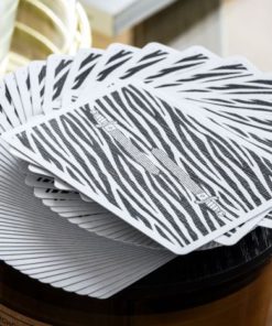
First, let’s talk about what’s the SAME as the 4th edition Orbit Deck. For starters, the feel. It took me 4 tries to get the feel exactly how I wanted it. I knew as soon as I picked up the 4ths that this was the way I wanted cards to feel. We have managed to duplicate the quality of the 4ths and I’m not sure if it’s just because they are brand new, but they feel just slightly smoother than the 4ths. Again, this might be my imagination — you be the judge. The cards are a crushed premium (Bee) stock, traditionally cut, and with a secret ingredient to ensure a unique feel just like the 4ths. The 5ths, much like their predecessors, has a one-way design that will be nearly impossible to find. I’ll be very impressed if you can find it. Come find me if you can’t.
Now let’s talk about what CHANGED in this edition.
Box
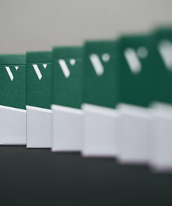
The boxes were much more expensive to print this time around due to the color on the inside as well as the matte finish of the paper used for the box. We dropped the “Playing Cards” from the front to give it a more minimal and streamlined aesthetic. These are more than just playing cards now. The vibrant orange on the inside of the box demands attention. Inside the box you’ll find some new text. As the brand grows, we’d like to connect everybody specifically through our Instagram page, since that will be the place where many future events will be happening.
Color
The teal and orange come in perfect timing for the start of summer in the Northern Hemisphere. The 4th Orbits were black, so it only makes sense to bring in some color and warmth for the 5ths. NASA was founded in 1958, which was 60 years ago this year. This is another reason why we chose teal. Teal was a very popular color for cars in 1958. The white and red specs found on the orange inside of the box are also a nod to the retro vibe.
Design
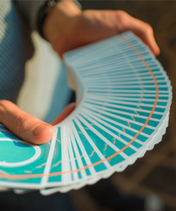
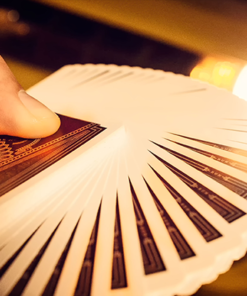
The 5th Edition design took a page out of the 4th Edition’s book with a design that that reveals its beauty in a fan. This time, we went to the very edge with the comet trail. It brings a brand new visual specifically made for cardistry. The mountains around the circle were inspired by the Uranian moon, Miranda. There are certain canyons on Miranda that go 12 times deeper than the Grand Canyon. We first discovered Miranda in 1948, the year my dad was born (the King of Hearts). The first time we took pictures of it was from Voyager 2 in 1986, the year I was born. When Voyager 2 passed Miranda, it blew us all away. This was the strangest moon we have ever seen. We were only able to see one side of her, so the rest of Miranda is a mystery. Each part of Miranda was unique, it had an assortment of terrains unlike any other moon observed before. I wanted to capture the awe that NASA must have felt.
Card Faces
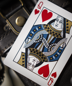
All colors have been given a matte finish to mimic the box’s matte look and feel. All the colors and textures were designed to give the card handler a uniform feeling of smoothness throughout. All face cards have a teal accent. We have added more crew onto those face cards as well. Nick Stumphauzer is the Jack of Clubs. Sean Oulashin is the Jack of Hearts. Daniel Schneider is the Jack of Spades. I am the Jack of Diamonds. The Jacks are the Orbit crew. My wife, Holly, is the Queen of Diamonds and my dad is the King of Hearts. After my Dad’s big surgery last year, we have spent every Tuesday together eating lunch and watching Dexter on Netflix. I feel like he’s doing a lot better than last year, which is why I decided to give the King of Hearts the 2nd heart back — it was taken from the 4ths.
Twenty-three thousand were printed at the US Playing Card Company. The Orbit Deck is now global and we have no intention of slowing. Complete your collection by adding the 5ths to your family of Orbits. I am no longer Orbit, we are.
THE KINGDOM CARDS EXPERIENCE
What People Are Saying...
Shaeffer
5⭐ service. The delivery company lost my order, and Anthony took care of everything. Absolutely awesome to deal with. I'll definitely be ordering from him again.
Ben
Shipping was extremely fast and the cards look fantastic!
Emily
I absolutely love the design of these cards. It's a small thing but having a unique deck just makes life a little brighter.
Rodney Merana
Fast delivery! Decks were carefully packed. I will definitely order from them again. Thanks again, Kingdom Cards!
Colin Childs
One of my favorite decks of all time. As usual, fantasia service from KingdomCards!
| Weight | 0.12 kg |
|---|---|
| Dimensions | 9.1 × 6.5 × 1.9 cm |
| Stock Status | Out of Stock |










Reviews
There are no reviews yet.